There is a time and a place for every typeface. Yes, even Comic Sans. But that doesn’t mean that there aren’t typefaces that I despise with a passion. For many, it’s Comic Sans. So much so, that there are entire websites like Ban Comic Sans dedicated to it’s atrocities. I don’t personally mind Comic Sans that much. My ‘Comic Sans’, if you will, is the typeface Giddy Up. Something about the fake cowboy motif and the stars just kind of irks me. I realize there’s a time and a place where it works as display type, but I hope I’m never around for that time or that place. Which led me to be completely floored when I came across this:
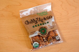
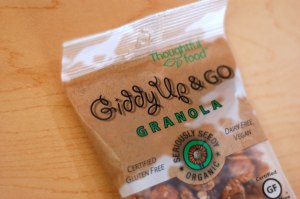
The Giddy Up & Go granola from Thoughtful Foods was pretty good. But I can’t figure out what happened with the name! How does a product end up with the same name as the prominent typeface that’s used on it’s packaging?!? There are two possible scenarios that I was able to come up with:
Scenario #1:
“Our product is called Giddy Up & Go granola. What typeface should we use for our packaging?”
“Oh hey! Look! There’s an awesome typeface that has the same name as our Granola!”
“We should use that! And be sure to put a drop shadow on it too!”
or
Scenario #2: We have this product, but we can’t figure out what to call it. We have these typefaces that we like for the packaging.
“Ooh! I like that swirly typeface… what’s it called?”
“It’s called Giddy Up.”
“That’s a great name! Lets call it “Giddy Up Granola!” and give it a drop shadow!”
I’m flabbergasted and dumbfounded. How does this happen? And why did it need that drop shadow on top of it all? The food might be ‘Thoughtful” but I’m not convinced the design is.